S04E15: R for Data Science - Exploratory Data Analysis
Chapter 7.3: Plotting the distributions of categorical and continuous variables
Setting up
To start with, we’ll only need to load the tidyverse, as we’ll explore a dataset that is automatically loaded along with it.
## You only need to install if you haven't previously done so
# install.packages("tidyverse")

library(tidyverse)
#> ── Attaching packages ─────────────────────────────────────── tidyverse 1.3.2 ──
#> ✔ ggplot2 3.3.6      ✔ purrr   0.3.5
#> ✔ tibble  3.1.8      ✔ dplyr   1.0.10
#> ✔ tidyr   1.2.1      ✔ stringr 1.4.1
#> ✔ readr   2.1.3      ✔ forcats 0.5.2
#> ── Conflicts ────────────────────────────────────────── tidyverse_conflicts() ──
#> ✖ dplyr::filter() masks stats::filter()
#> ✖ dplyr::lag()    masks stats::lag()
We’ll be working with the diamonds dataset today, so let’s take a quick look at it before we begin:
diamonds
#> # A tibble: 53,940 × 10
#>    carat cut       color clarity depth table price     x     y     z
#>    <dbl> <ord>     <ord> <ord>   <dbl> <dbl> <int> <dbl> <dbl> <dbl>
#>  1  0.23 Ideal     E     SI2      61.5    55   326  3.95  3.98  2.43
#>  2  0.21 Premium   E     SI1      59.8    61   326  3.89  3.84  2.31
#>  3  0.23 Good      E     VS1      56.9    65   327  4.05  4.07  2.31
#>  4  0.29 Premium   I     VS2      62.4    58   334  4.2   4.23  2.63
#>  5  0.31 Good      J     SI2      63.3    58   335  4.34  4.35  2.75
#>  6  0.24 Very Good J     VVS2     62.8    57   336  3.94  3.96  2.48
#>  7  0.24 Very Good I     VVS1     62.3    57   336  3.95  3.98  2.47
#>  8  0.26 Very Good H     SI1      61.9    55   337  4.07  4.11  2.53
#>  9  0.22 Fair      E     VS2      65.1    61   337  3.87  3.78  2.49
#> 10  0.23 Very Good H     VS1      59.4    61   338  4     4.05  2.39
#> # … with 53,930 more rows
On each row, we have information about one individual diamond, such as its carat and price. (x, y, and z represent the diamond’s length, width, and depth, respectively.)
Since we’ll be making a bunch of plots with ggplot2, let’s use the following trick to set an overarching “theme” for all plots that is a little better-looking than the default one:
# This changes two things:
# - theme_minimal() gives an overall different look, with a white background
# - base_size = 14 will make the text relatively bigger
theme_set(theme_minimal(base_size = 14))
Chapter 7.3: Variation
Exploring variation in a categorical variable
Let’s say we want to see how many diamonds there are for each value of cut. When we printed the first lines of the dataframe above, we could see that cut has values like Ideal, Premium, and Good: this is therefore a “categorical” and not a “continuous” variable.
We could also see that the data type indication for cut was <ord>, which is short for ordered factor. In R, categorical variables can be represented not just as character strings or integers, but also as factors. Factors have a defined set of levels which can be assigned a custom order. That is handy when plotting or when you need to set a reference level in a statistical model. (For more, see the page for this previous Code Club session on factors.)
To quickly see which values the variable cut contains, and what their frequencies are, we can use count():
diamonds %>% count(cut)
#> # A tibble: 5 × 2
#>   cut           n
#>   <ord>     <int>
#> 1 Fair       1610
#> 2 Good       4906
#> 3 Very Good 12082
#> 4 Premium   13791
#> 5 Ideal     21551
To get a feel for the distribution of a categorical variable, making a barplot can also be useful. Recall that when making a plot with ggplot2, we at least need the following components:
-
The
ggplot()function, in which we supply the dataframe that we want to use. -
A geom function, which is basically the type of plot we want to make, such as
geom_point()for a scatterplot andgeom_bar()for a barplot. -
An “aesthetic mapping” that defines which variables to plot along the axes.
For a barplot showing cut, our ggplot2 code would look as follows:
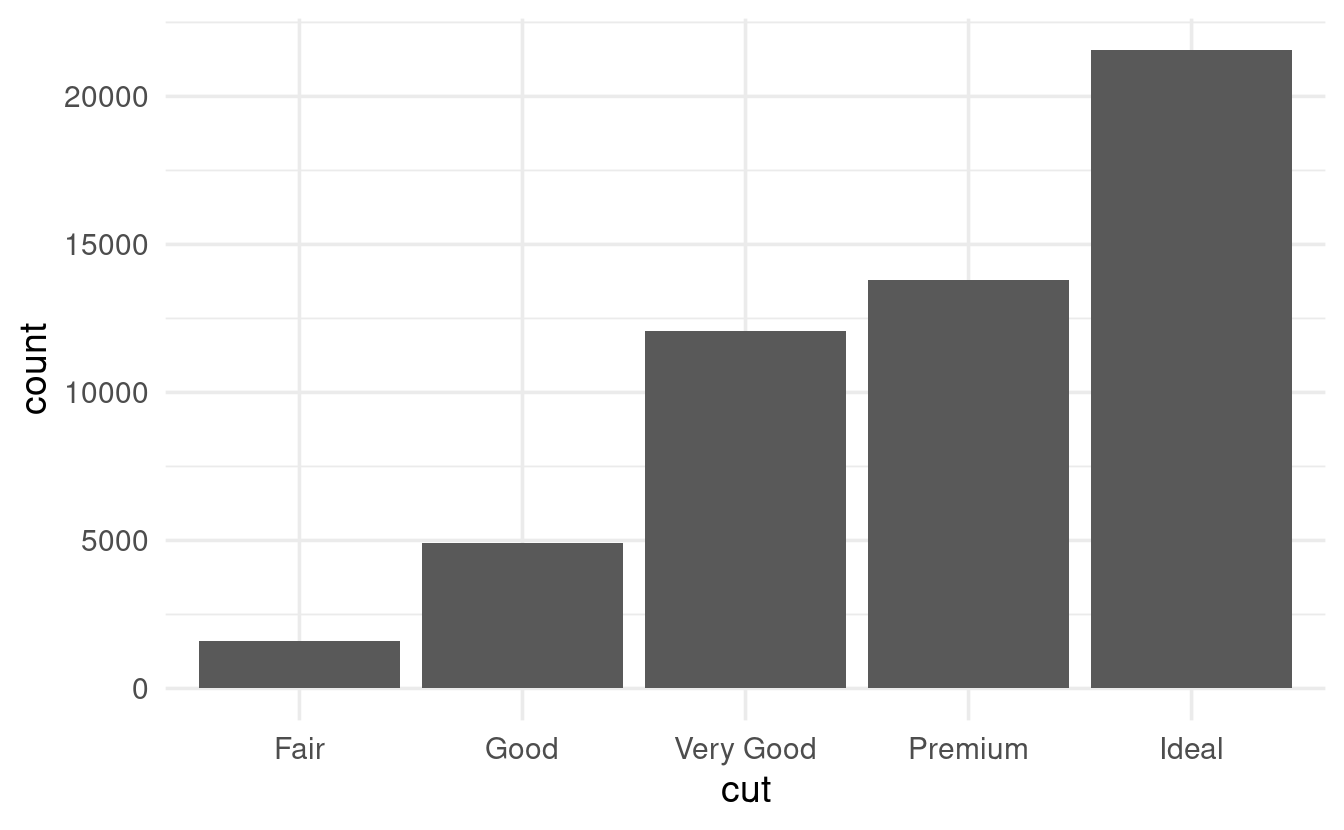
When making plots, we typically specify which variable should go along the y-axis, too. But that is not the case for barplots, where the default is to automatically plot a count which is computed from the data.
Exploring variation in a continuous variable
We’ll take another look at the diamonds dataframe and pick a continuous variable:
diamonds
#> # A tibble: 53,940 × 10
#>    carat cut       color clarity depth table price     x     y     z
#>    <dbl> <ord>     <ord> <ord>   <dbl> <dbl> <int> <dbl> <dbl> <dbl>
#>  1  0.23 Ideal     E     SI2      61.5    55   326  3.95  3.98  2.43
#>  2  0.21 Premium   E     SI1      59.8    61   326  3.89  3.84  2.31
#>  3  0.23 Good      E     VS1      56.9    65   327  4.05  4.07  2.31
#>  4  0.29 Premium   I     VS2      62.4    58   334  4.2   4.23  2.63
#>  5  0.31 Good      J     SI2      63.3    58   335  4.34  4.35  2.75
#>  6  0.24 Very Good J     VVS2     62.8    57   336  3.94  3.96  2.48
#>  7  0.24 Very Good I     VVS1     62.3    57   336  3.95  3.98  2.47
#>  8  0.26 Very Good H     SI1      61.9    55   337  4.07  4.11  2.53
#>  9  0.22 Fair      E     VS2      65.1    61   337  3.87  3.78  2.49
#> 10  0.23 Very Good H     VS1      59.4    61   338  4     4.05  2.39
#> # … with 53,930 more rows
Let’s explore the variation in the continuous variable carat, and do so by making a histogram using geom_histogram():
ggplot(data = diamonds) +
  geom_histogram(mapping = aes(x = carat))
#> `stat_bin()` using `bins = 30`. Pick better value with `binwidth`.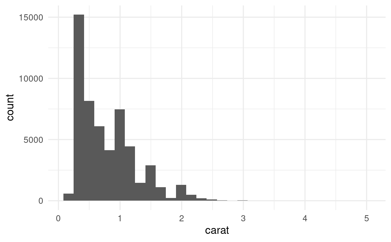
Under the hood, a histogram discretizes the continuous data into bins, and then shows the counts (here: number of diamonds) in each bin. We may want to play around with the width of the bins to see more fine-grained or coarse-grained patterns, and can do so using the binwidth argument:
ggplot(data = diamonds) +
  geom_histogram(mapping = aes(x = carat), binwidth = 0.5)

If we wanted to see this kind of representation in table-form, using count() directly wouldn’t work: we don’t have a column with bins for carat, only the raw, numeric values.
To create bins, we can use the ggplot2 function cut_width, whose width argument is equivalent to geom_histogram’s binwidth:
diamonds %>%
  mutate(carat_discrete = cut_width(carat, width = 0.5)) %>%
  count(carat_discrete)
#> # A tibble: 11 × 2
#>    carat_discrete     n
#>    <fct>          <int>
#>  1 [-0.25,0.25]     785
#>  2 (0.25,0.75]    29498
#>  3 (0.75,1.25]    15977
#>  4 (1.25,1.75]     5313
#>  5 (1.75,2.25]     2002
#>  6 (2.25,2.75]      322
#>  7 (2.75,3.25]       32
#>  8 (3.25,3.75]        5
#>  9 (3.75,4.25]        4
#> 10 (4.25,4.75]        1
#> 11 (4.75,5.25]        1
Multiple variables
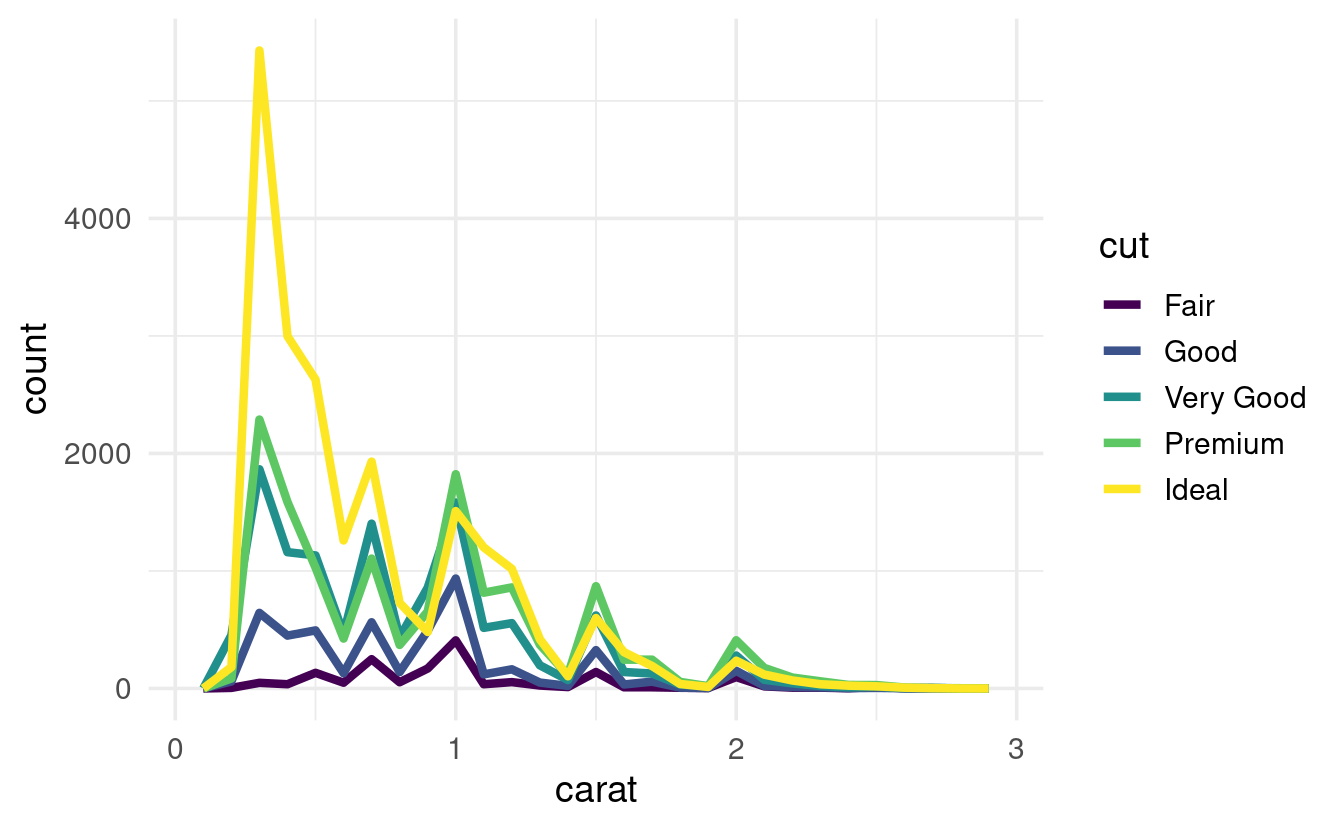
If we want to show the variation in carat separately for each level of cut, we can map carate also to fill, which is the fill color of the bars:
# First, let's subset the data to only keep relatively small diamonds:
smaller <- diamonds %>% filter(carat < 3)

# Then, we make the plot:
ggplot(data = smaller,
       mapping = aes(x = carat, fill = cut)) +
  geom_histogram(binwidth = 0.1, color = "grey20")

# Above, note that:
# - The mapping is now inside 'ggplot()', and we used 'cut' twice
# - In geom_histogram(), color is _not_ a mapping and is for the color of the border
Though in a case like this, a linegraph with geom_freqpoly() might be easier to interpret:
ggplot(data = smaller,
       mapping = aes(x = carat, colour = cut)) +
  geom_freqpoly(binwidth = 0.1, size = 1.5) # (Making thicker lines with 'size')
Unusual values (outliers)
Sometimes, plots like histograms have very wide axis limits yet no visible bars on the sides:
ggplot(diamonds) +
  geom_histogram(mapping = aes(x = y), binwidth = 0.5)
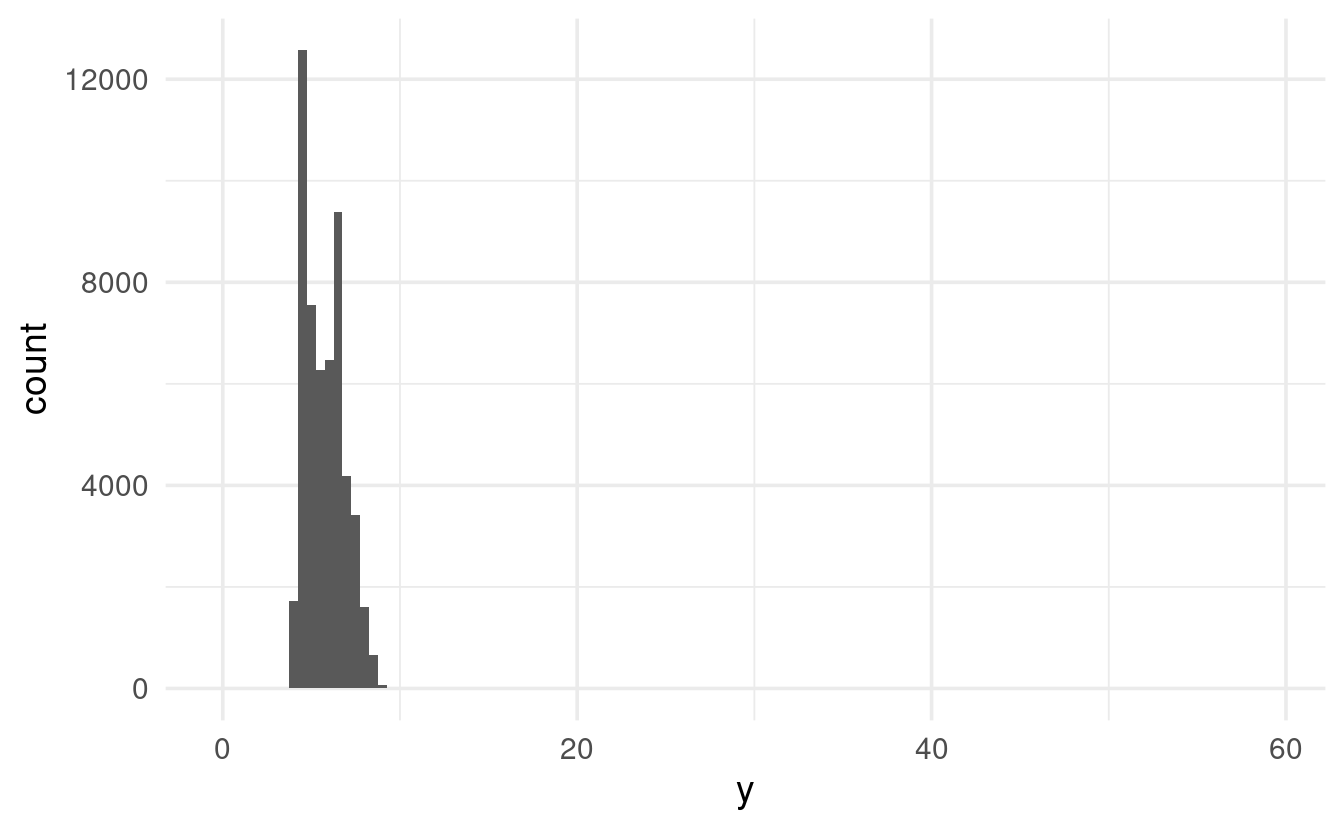
The x-axis limits are automatically picked based on the data, so there really should be some values all the way up to about 60. We just can’t see them, since the y-axis scale goes all the way up to 12,000.
If we want to see these counts in the graph, we can zoom in on the y-axis with coord_cartesian():
ggplot(diamonds) +
  geom_histogram(mapping = aes(x = y), binwidth = 0.5) +
  coord_cartesian(ylim = c(0, 50)) # c(<lower-limit>, <upper-limit>)

Note that in ggplot2, zooming in on a graph and setting axis limits isn’t the same thing: you’ll learn more about that in the exercises.
Of course we could also try to find these values in the dataframe itself, which might be more useful than a graph in cases like this. To do so, we can use the filter() function we learned about in the previous chapter:
diamonds %>% filter(y < 3 | y > 20)
#> # A tibble: 9 × 10
#>   carat cut       color clarity depth table price     x     y     z
#>   <dbl> <ord>     <ord> <ord>   <dbl> <dbl> <int> <dbl> <dbl> <dbl>
#> 1  1    Very Good H     VS2      63.3    53  5139  0      0    0
#> 2  1.14 Fair      G     VS1      57.5    67  6381  0      0    0
#> 3  2    Premium   H     SI2      58.9    57 12210  8.09  58.9  8.06
#> 4  1.56 Ideal     G     VS2      62.2    54 12800  0      0    0
#> 5  1.2  Premium   D     VVS1     62.1    59 15686  0      0    0
#> 6  2.25 Premium   H     SI2      62.8    59 18034  0      0    0
#> 7  0.51 Ideal     E     VS1      61.8    55  2075  5.15  31.8  5.12
#> 8  0.71 Good      F     SI2      64.1    60  2130  0      0    0
#> 9  0.71 Good      F     SI2      64.1    60  2130  0      0    0
Breakout Rooms
These exercises will continue to use the diamonds data, which is automatically loaded when you load the tidyverse.
Exercise 1
In the diamonds data, explore the distribution of price, which is the price of a diamond in USD. Do you discover anything unusual or surprising?
Make sure to try different values for the binwidth argument!
Hints (click here)
-
This is a continuous variable, so use
geom_histogram(). -
A more fine-grained plot (smaller bins with
binwidth) than the default should reveal something odd. -
You might want to use
coord_cartesian()to see the area with the odd pattern in more detail. (Alternatively, you could tryfilter()ing the data before plotting.)
Solution (click here)
geom_histogram()with default settings doesn’t reveal anything too weird:
ggplot(data = diamonds,
       mapping = aes(x = price)) +
  geom_histogram()
#> `stat_bin()` using `bins = 30`. Pick better value with `binwidth`.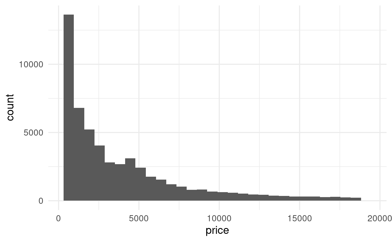
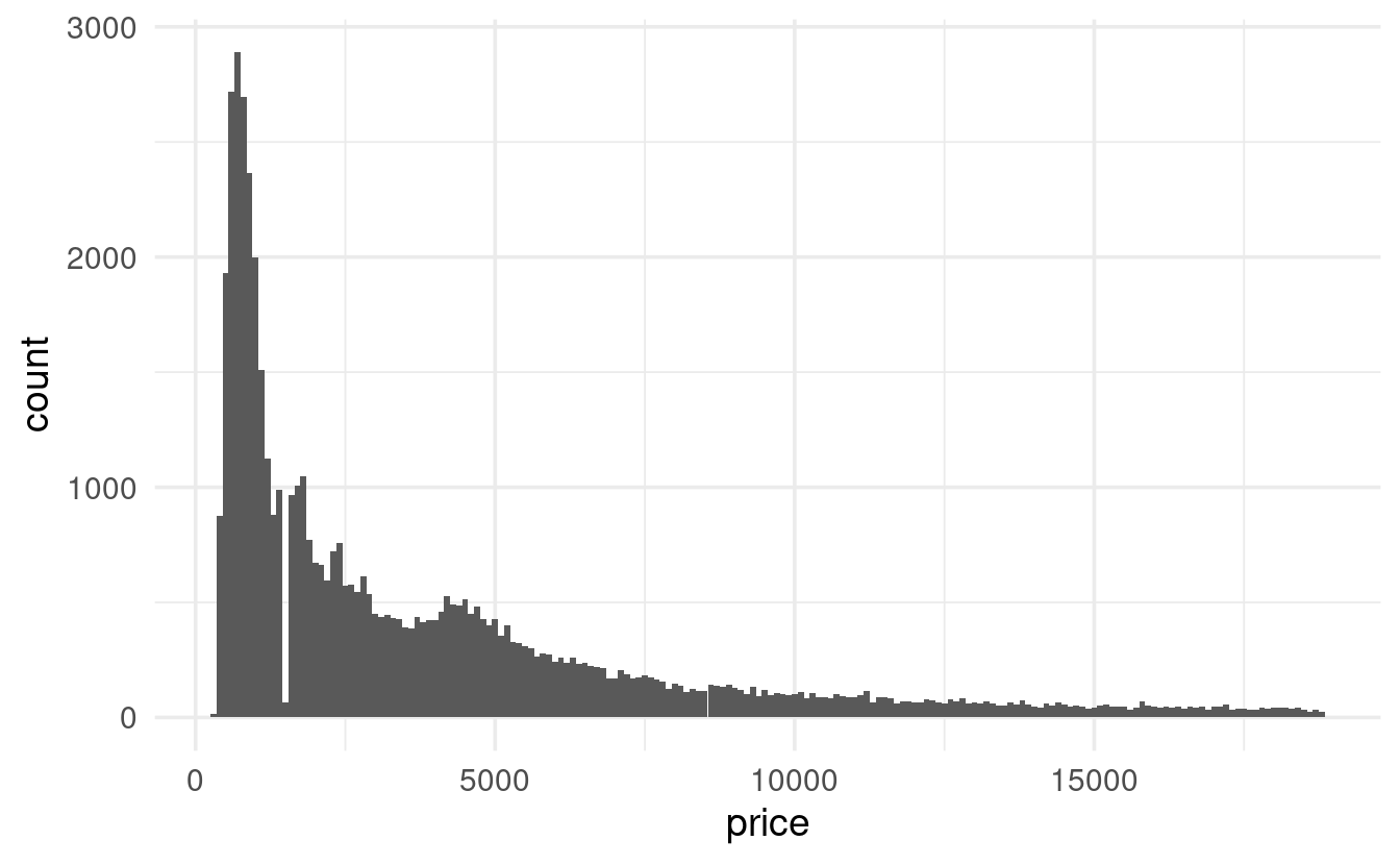
- But with a binwidth of e.g. 100, we start to see something odd: a gap in the distribution.
ggplot(data = diamonds,
       mapping = aes(x = price)) +
  geom_histogram(binwidth = 100)
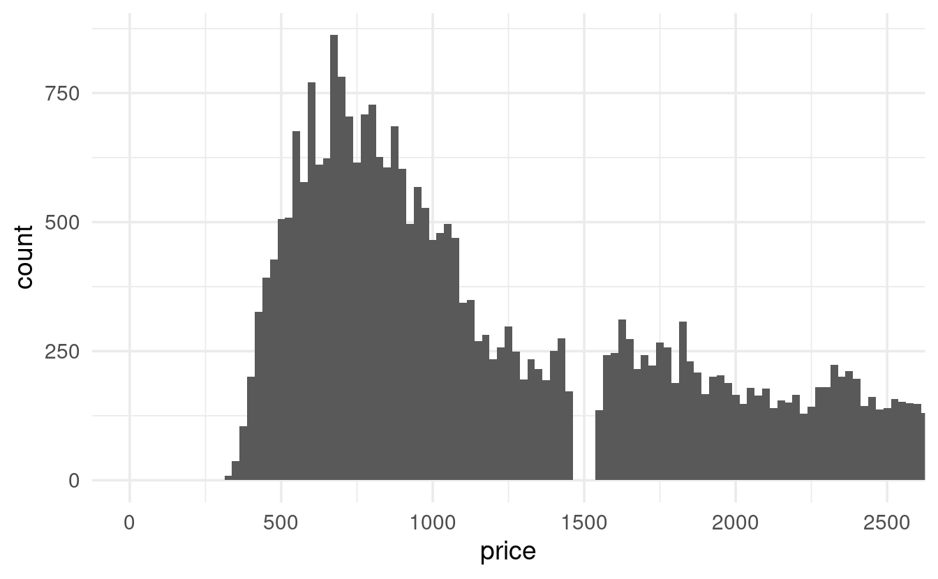
- Let’s take a closer look by zooming in on prices of $2,500 or less:
diamonds %>%
  ggplot(mapping = aes(x = price)) +
  geom_histogram(binwidth = 25) +
  coord_cartesian(xlim = c(0, 2500))
(An alternative approach would be to filter the data before plotting:)
diamonds %>%
  filter(price < 2500) %>%
  ggplot(mapping = aes(x = price)) +
  geom_histogram(binwidth = 25)
I have no idea why there are no diamonds with a price of around $1,500 – anybody?
Exercise 2
Compare coord_cartesian() with the similar function lims() to see a narrower range along the y-axis for a histogram. Specifically, make two histograms of price with a y-axis that only goes up to 3,000: one with coord_cartesian(ylim = ...) and one with lims(y = ...).
What is happening in the graph made with lims()?
(See the hint for example usage of lims(), a function we haven’t seen yet.)
Hints (click here)
You can use lims() to set arbitrary axis limits:
ggplot(diamonds) +
  geom_point(mapping = aes(x = x, y = y)) +
  lims(x = c(5, 10),   # c(<lower-limit>, <upper-limit>)
       y = c(0, 20))   # c(<lower-limit>, <upper-limit>)
#> Warning: Removed 17593 rows containing missing values (geom_point).
You could also use the very similar ylim() / xlim() pair of functions, though note the slightly simplified syntax:
ggplot(diamonds) +
  geom_point(mapping = aes(x = x, y = y)) +
  xlim(5, 10) +   # Note: you don't pass a vector inside 'c()' here
  ylim(0, 20)
#> Warning: Removed 17593 rows containing missing values (geom_point).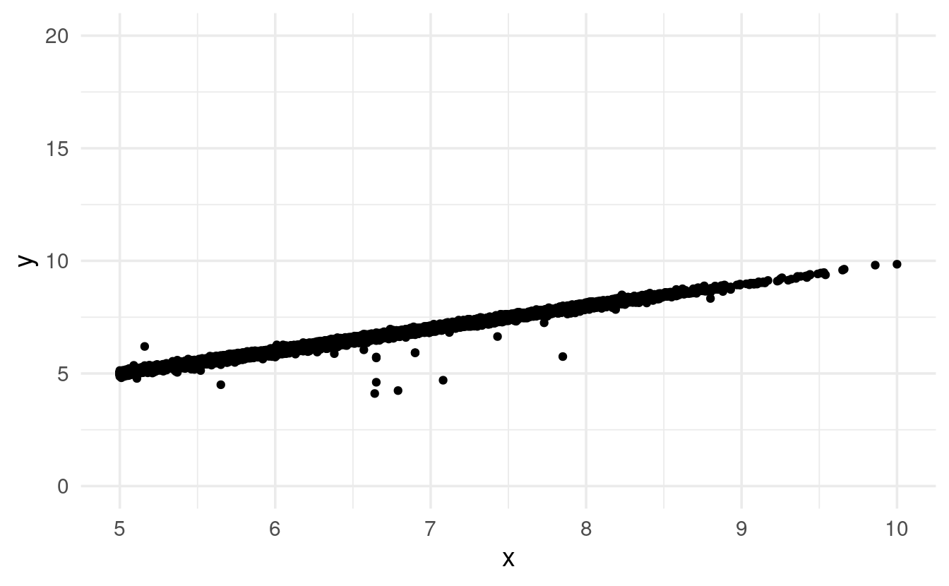
Solution (click here)
Whereas the graph produced with coord_cartesian() is simply “cut off” at the specified limit, the graph produced with lims() is missing bars!
It turns out that ggplot2 removes the bars that can’t be shown given our y-limit. Notice that it warns us about doing so: #> Warning: Removed 5 rows containing missing values (geom_bar).
ggplot(diamonds) +
  geom_histogram(mapping = aes(x = price)) +
  coord_cartesian(ylim = c(0, 3000))
#> `stat_bin()` using `bins = 30`. Pick better value with `binwidth`.
ggplot(diamonds) +
  geom_histogram(mapping = aes(x = price)) +
  lims(y = c(0, 3000))
#> `stat_bin()` using `bins = 30`. Pick better value with `binwidth`.#> Warning: Removed 5 rows containing missing values (geom_bar).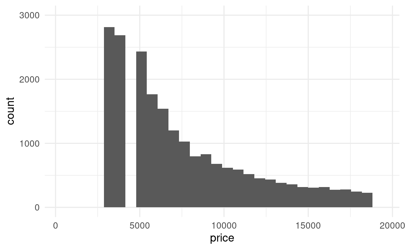
Exercise 3
Using scatterplots, explore the relationship between the width y and the depth z of the diamonds.
What do you think about the outliers? Are they more likely to be unusual diamonds or data entry errors?
Hints (click here)
-
Make a scatterplot with
geom_point(). -
Zoom in on the area with most points, to get a better feel for the overall relationship between
yandz. -
Could a diamond with a value of
ylarger than 20 just be a very large diamond? Or does the corresponding value forz, and the overall relationship betweenyandzmake it more likely that they are outliers?
Solution (click here)
Let’s start with a simple scatterplot with all data and default axis limits:
ggplot(data = diamonds,
       mapping = aes(x = z, y = y)) +
  geom_point()
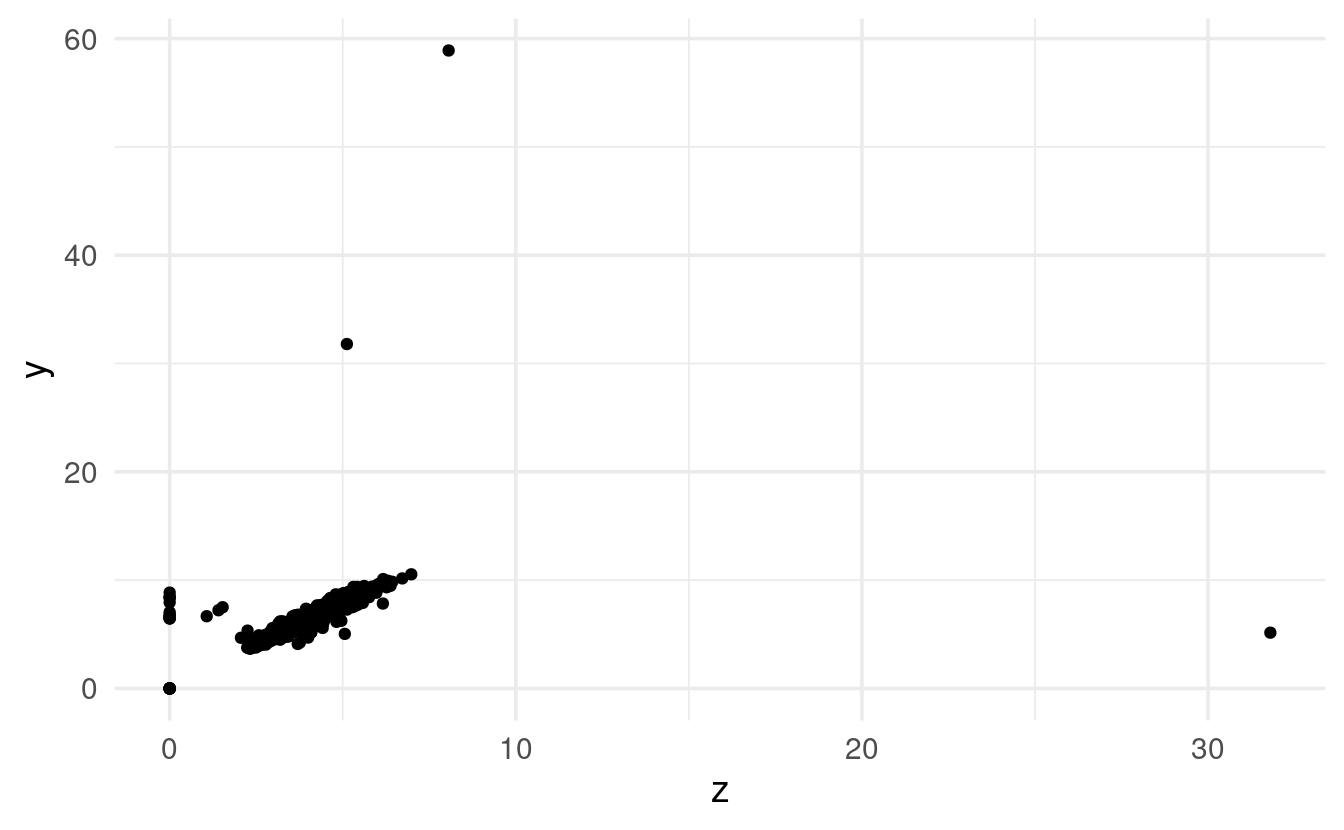
Phew! There are definitely some striking outliers. Let’s zoom in on the main cloud of points:
ggplot(data = diamonds,
       mapping = aes(x = z, y = y)) +
  geom_point() +
  coord_cartesian(xlim = c(0, 10), ylim = c(0, 15))
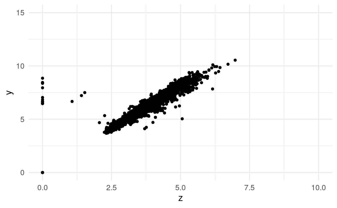
That looks like an overall very tight correlation between width (y) and depth (z).
Therefore, the outliers of y and z don’t just seem to represent very large or very small diamonds, and are likely data entry errors or something along those lines.
Exercise 4 (bonus)
Explore the distribution of carat. Specifically, compare the number of diamonds of 0.99 (and a little less) carat and those of 1 (and a little more) carat? What do you think is the cause of the difference?
Hints (click here)
-
Make a histogram (
geom_histogram()) forcarat, and optionally zoom in to the area around 1. -
Use
filter()andcount()to specifically check out the diamond counts with a carat of around 1.
Solution (click here)
We can start by simply making a histogram for carat:
ggplot(data = diamonds,
       mapping = aes(x = carat)) +
  geom_histogram(binwidth = 0.01)
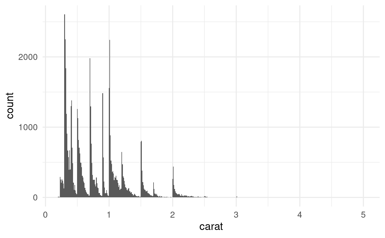
That’s a weird pattern, with a bunch of peaks and valleys! Let’s just show the area around a carat of 1:
diamonds %>%
  filter(carat > 0.9, carat < 1.1) %>%
  ggplot(mapping = aes(x = carat)) +
  geom_histogram(binwidth = 0.01)
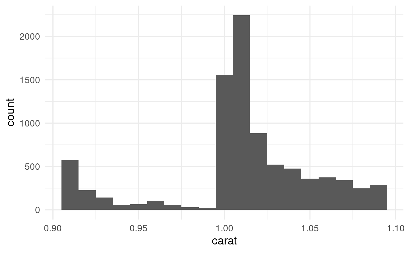
There’s clearly a big uptick around 1, but checking out the raw counts would make it easier to answer the original question:
diamonds %>%
  filter(carat > 0.9, carat < 1.1) %>%
  count(carat)
#> # A tibble: 19 × 2
#>    carat     n
#>    <dbl> <int>
#>  1  0.91   570
#>  2  0.92   226
#>  3  0.93   142
#>  4  0.94    59
#>  5  0.95    65
#>  6  0.96   103
#>  7  0.97    59
#>  8  0.98    31
#>  9  0.99    23
#> 10  1     1558
#> 11  1.01  2242
#> 12  1.02   883
#> 13  1.03   523
#> 14  1.04   475
#> 15  1.05   361
#> 16  1.06   373
#> 17  1.07   342
#> 18  1.08   246
#> 19  1.09   287
There are suspiciously few diamonds with a carat of 0.99 (and, to a lesser extent, with a carat anywhere above 0.9): could there be some rounding-up going on?